Total Solar Eclipse 2024
Guided Data Sonification of the Path of Totality
April 8th, 2024
Guided Data Sonification of the Path of Totality
April 8th, 2024

Audio-Visual Eclipse
April 8th, 2024 marked an exciting astronomical event - a total solar eclipse! Viewers of this rare phenomenon could experience a darkening effect of the sky and a quieting of the environment, caused by the moon obstructing the light of the sun. The full expression of the eclipse could be witnessed along the path of totality, which on this occasion ran in a northeast trajectory across North America, from Texas to Maine.
April 8th, 2024 marked an exciting astronomical event - a total solar eclipse! Viewers of this rare phenomenon could experience a darkening effect of the sky and a quieting of the environment, caused by the moon obstructing the light of the sun. The full expression of the eclipse could be witnessed along the path of totality, which on this occasion ran in a northeast trajectory across North America, from Texas to Maine.
I created an audio-visual map containing a guided data sonification (turning data to sound) of the eclipse's path of totality. This project was in support of the Georgia Tech Sonification Lab's efforts to create accessibility resources for the 2024 total solar eclipse.
The Process
This project involved several phases, such as brainstorming and ideation, data wrangling, sound design, data visualization, and animation.
Scroll past the video below to find a deeper dive into the project process, including ideation sketches, explorations about the data sonification sound design, and justification for the audio-visual presentation.
The Benefits of Data Sonification
Data sonification, the practice of transforming data into sound, has enormous potential in information communication, and is beneficial in two significant ways.
First, expressing data in the form of audio makes data accessible to people who are visually impaired or blind. There is a heavy reliance on visualization in data analysis and educational storytelling, but by integrating sonification into these realms, data can be consumed without reliance on sight.
Second, data sonification is beneficial for engagement, sparking curiosity, and stirring emotion within someone. A sound composition may have the power to activate a poignant reaction more than a static image can. In our world digital information consumption, there is a great opportunity to craft multimodal data representations which draw in the listener and open the door of curiosity in an audience.
The total solar eclipse, which might normally be experienced only visually, presented an opportunity to design a sonically accessible rendition. But the challenge would be how to design an effective sonification. The process of designing this particular sonification project is elaborated below.
Design Choice #1: Mapping Geography to Sound.
How do you convey geographical movement in the form of audio? One way is to associate latitude with pitch, and longitude with stereo image. As a data point moves from south to north, the listener will hear a change from low notes to high notes. As a data point moves from west to east on a map, the listener will hear a "panning" effect from left to right in their speakers or headphones. I felt that this would be an intuitive approach for expressing the path of totality through sound.
How do you convey geographical movement in the form of audio? One way is to associate latitude with pitch, and longitude with stereo image. As a data point moves from south to north, the listener will hear a change from low notes to high notes. As a data point moves from west to east on a map, the listener will hear a "panning" effect from left to right in their speakers or headphones. I felt that this would be an intuitive approach for expressing the path of totality through sound.
I also wanted to sonically capture major cities along the route of totality. I decided to include timed "flourishes" (a few notes played in quick succession) for each major city passed, as well as a quietly spoken announcement of the city name. This is where the layering aspect of data sonification design comes into play. I needed to decide how many data features I wanted to represent, and how to map these features to audio parameters which could coexist in a single composition.
Beyond these choices, it was a matter of developing the specific sound design, musicality, and presentation.
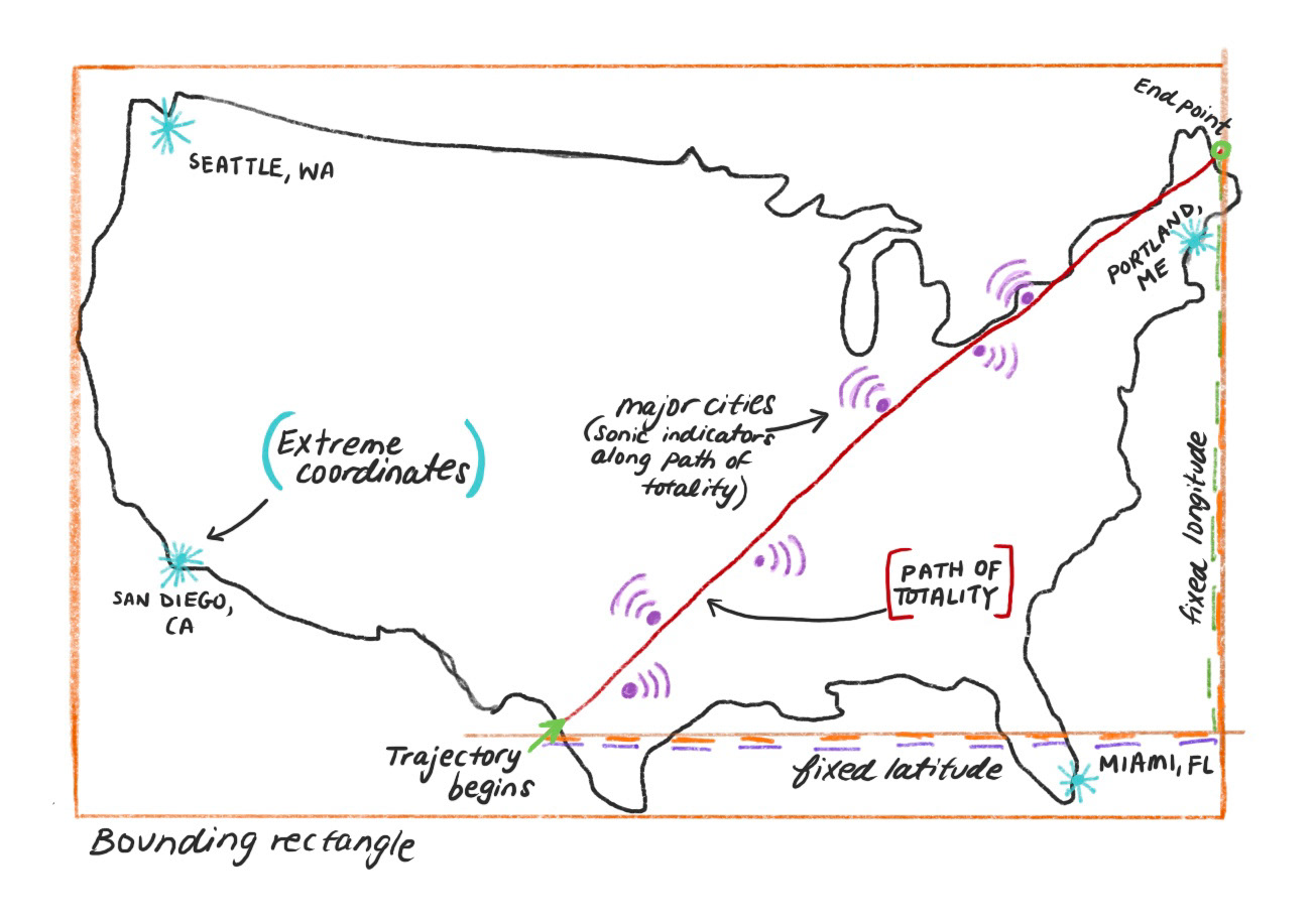
Figure A: Initial sketch of the visual map of the path of totality and accompanying sound components (path, extreme coordinates, and major cities).
Imagine The United States being bounded by a rectangle. The pitch range is determined by the corners of this rectangle, which I refer to as the “extreme coordinates.” The extreme geographical coordinates are indicated by "dings," to introduce the listener to the sonic framework. Coordinates on the left side of the rectangle are panned to the left speaker, while coordinates on the right side of the rectangle are panned to the right speaker. The path of totality moves diagonally in a northeast direction across the bounding region, from Texas to Maine. Pitch increases over this span, and position in the stereo field shifts from left to right. Major cities are indicated by sonic flourishes along the path of totality as the eclipse position moves past each one. The name of each city, quietly spoken, is also layered into the sonification.
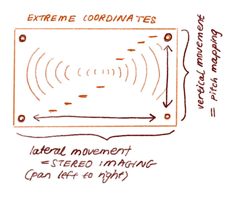
Figure B: Exploration of the audio parameter mapping, determined by the geographical bounding rectangle.
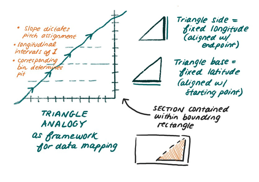
Figure C: Exploration of how to map the path of totality to musical notes. Using a “triangle” analogy, where the base contains evenly spaced longitude values, and the side contains evenly spaced latitude values. Just like on a piece of graph paper!
Design Choice #2: Exploring Musicality.
To make a data sonification pleasant and engaging, it's helpful to bring forth a sense of musicality. I thought it would be nice to represent the path of totality with a series of arpeggios, each starting with a higher note as latitude increases.
To make a data sonification pleasant and engaging, it's helpful to bring forth a sense of musicality. I thought it would be nice to represent the path of totality with a series of arpeggios, each starting with a higher note as latitude increases.
I decided to limit the pitch mapping to a G major scale, to create a sense of auditory harmony.
A note on pitch mapping... In data sonification, if you are mapping numbers to pitch, you have the option of mapping to a chromatic scale and/or including semitones, which provides you with more notes to work with and increases representation accuracy. But this can often sound dissonant and non-musical, which is not necessarily the most pleasant listening experience. Another option in pitch mapping is to group numeric values and assign them to a musical scale, which limits the number of notes at your disposal, but ensures more musicality.
Arpeggios for musicality... Rather than use individual notes within the G major scale, I decided to map each latitudinal coordinate along the path of totality to an arpeggio (notes played in sequence) in the key of G. This added to the feeling of ascension: ascending notes in sequence with ascending latitude on the map.
In addition to the arpeggios, I integrated brief musical flourishes (groupings of a few notes in the key of G) to represent major cities along the path of totality. These are layered on top of the arpeggios over the course of the path of totality.
Finally, to create an underlying musical foundation and sense of wholeness, I implemented two chordal violin expressions in the key of G. The first of these is a deep, resounding chord in the lower register of the scale, fading out at the halfway point of the path of totality. The second chord is in the higher register, fading in at the halfway point and ending with the completion of the sonification.
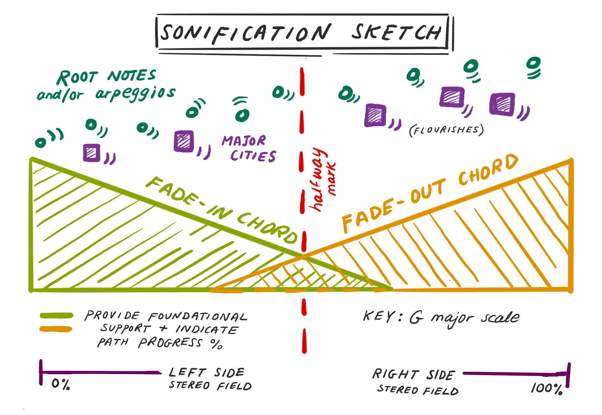
Figure D: Sketch of the audio elements constituting the data sonification. The sketch can be read from left to right. Arpeggios increasing in pitch along the path are indicated in dark turquoise dots. Sonic flourishes for major cities are indicated by purple squares. The green triangle on the left indicates the lower register violin chord, fading out at the red halfway line. The orange triangle on the right indicates the higher register violin chord, fading in at the red halfway line. Along the bottom, the movement along the stereo field is expressed from 0% to 100%.
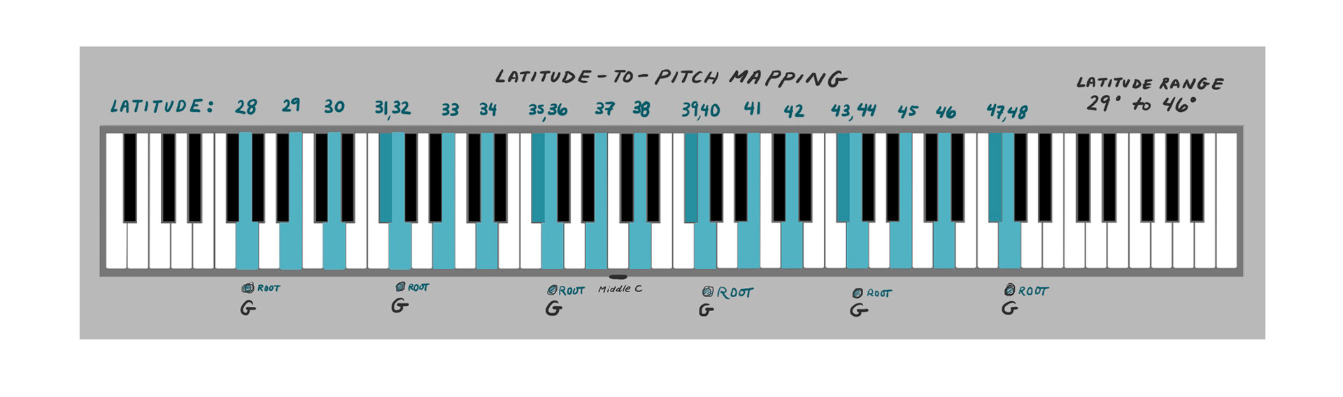
Figure E: Visual representation of mapping latitude values to notes within the key of G along the piano keyboard. In the final sonification, the mapping is actually shifted such that latitude value 29 corresponds to the lowest G note.
Design Choice #3: Presentation through Guided Narration.
The presentation of a data sonification is particularly important, to ensure that the listener can successfully understand the sonification. As interesting or pleasing as a sonification may sound, a listener will not be able to walk away with an informed perspective if they are not first introduced to the meaning behind each audio parameter. However, if the presentation of the data sonification is structured so that it contains narration and guidance, the audience can better understand the data. I like to call this building a “sonic lexicon.” In learning the vocabulary of the audio parameters, the listener can recognize and understand them when they appear in the context of the macro composition.
Jordan Wirfs-Brock, an avid practitioner of data sonification with whom I’ve had the opportunity to collaborate, has greatly influenced me in this regard. She emphasizes the importance of training the listener, to provide more familiarity with data sonification and ensure an educational experience. A great example of this can be found in this interview on Marketplace about her data sonification of stock market volatility in 2020.
To implement a narrative structure, I wrote a script that I would follow to present the listener with a sonic lexicon and framework for this data sonification project. I decided to introduce the extreme coordinates to give a frame of reference, for example: “Here’s what Seattle, Washington sounds like: [ding!].” By first introducing the audio elements of the project, I felt confident that the full data sonification would make sense to the listener.
Reflections, Limitations, and Next Steps
There are innumerable ways one can approach data sonification, and this is just one way. The number of variations one can take within the process, from the audio parameters chosen, to the degree of musicality, to the interpretation of the data, and beyond. Another step I would have liked to try with this project is to make it interactive; I’d like to make an audio-visual map containing sonifications which a user could explore and learn at their own pace. I’d also like to explore the use of different audio parameters. While I think “longitude to stereo field” mapping is intuitive as a means of “hearing” West to East, it is limited in that the effect is best experienced with quality headphones or speakers (rather the typical laptop or phone speakers). I’d also be interested to branch out of the limited major scale that I chose for latitude representation; I think the arpeggios progressed too predictably to be intriguing.
With every project I create, there is always something I know I could have done better or differently (especially upon reflection). But ultimately, the value lies in the learning process. I know that with each subsequent project, I can bring a new insight forward. I’m looking forward to sharing the realm of data sonification with more audio enthusiasts, and I hope to create projects that will spark more curiosity in people who wish to tell stories with data.