What Are Undergraduates Studying? [1970 - 2019]
A data sonification comparing bachelor degrees over time
{July 2023}
{July 2023}

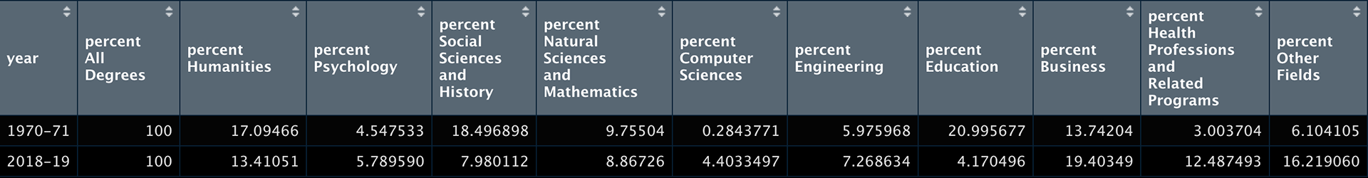
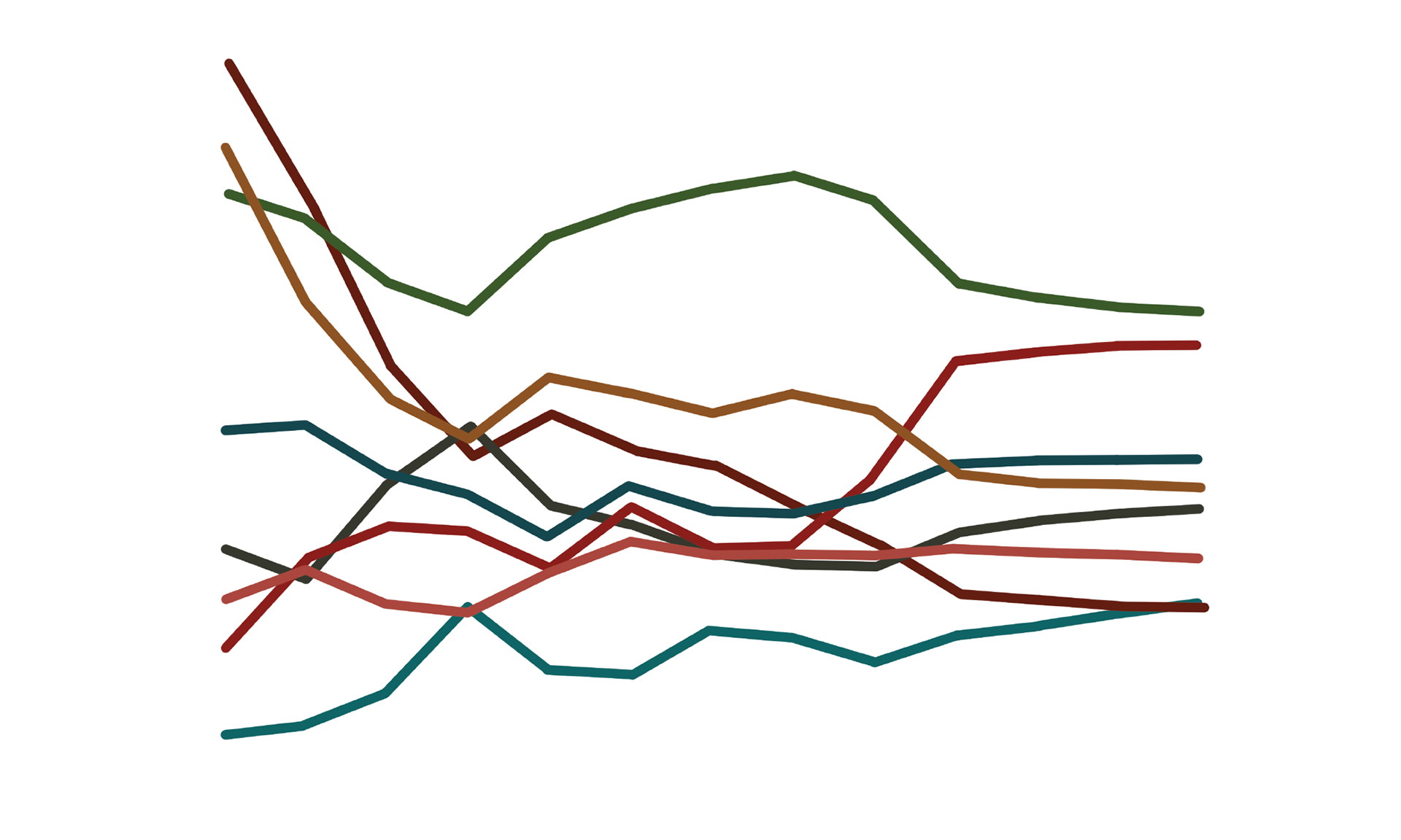
Ever wonder what academic pursuits become more popular (or less so) as industries evolve? A dataset from the U.S. from the National Center for Education Statistics (U.S. Department of Education) shows how higher education degrees are broken down by academic field each year over the course of the last few decades.
Focusing on bachelor degrees specifically, I created a data sonification to represent the change in degrees conferred by field of study from 1970 to 2019. The percentage value, which is the portion of all degrees attributed to a particular academic field, is mapped to the C major scale. The final musical chord for each category represents the distribution of values, stacking all mapped notes for each year of data.
The complete data sonification and animation

Icons to represent each category, digitally illustrated in Procreate
STEPS:
1. Data wrangling in R
2. Sonification mapping to C major scale
3. Software instrument application and sonic arrangement (Logic Pro X)
4. Digital illustrations of icons to represent each category of study (Procreate)
5. Frame preparation, building accurate replications of graphs, adding text, stacking icons (Adobe Photoshop)
6. Animation video using still frames and sonification (Adobe Premiere Pro)
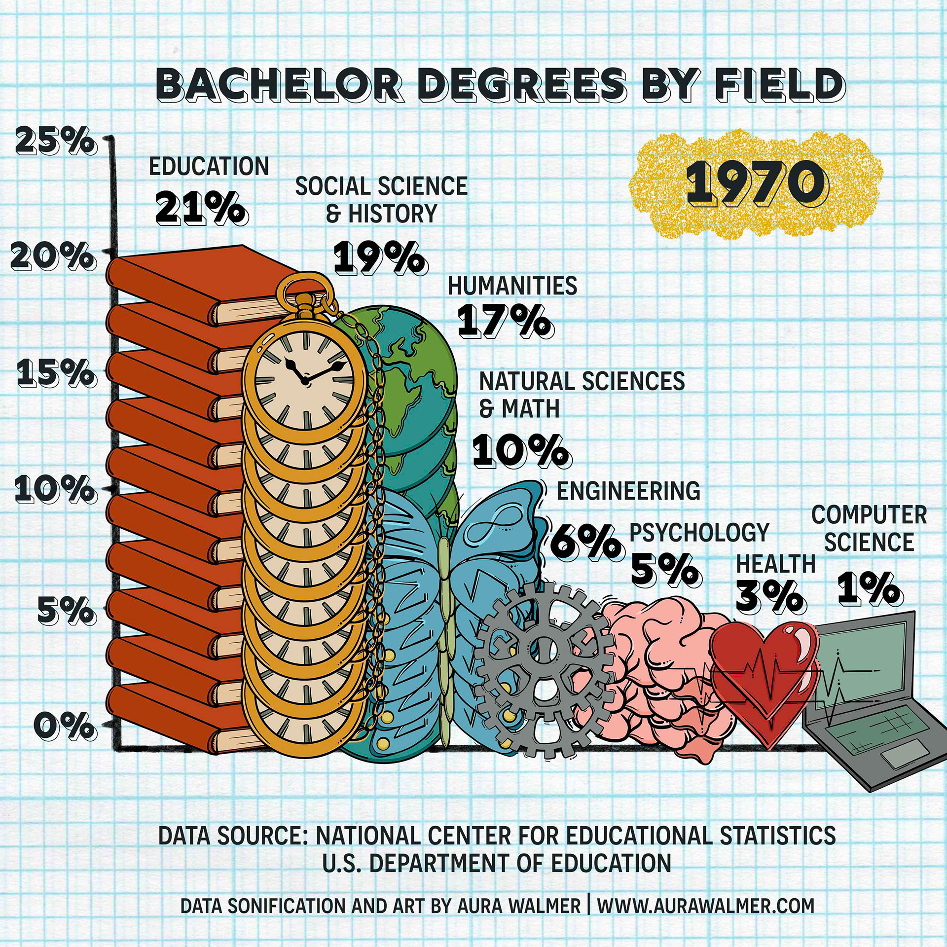
Compilation of all categories in 1970
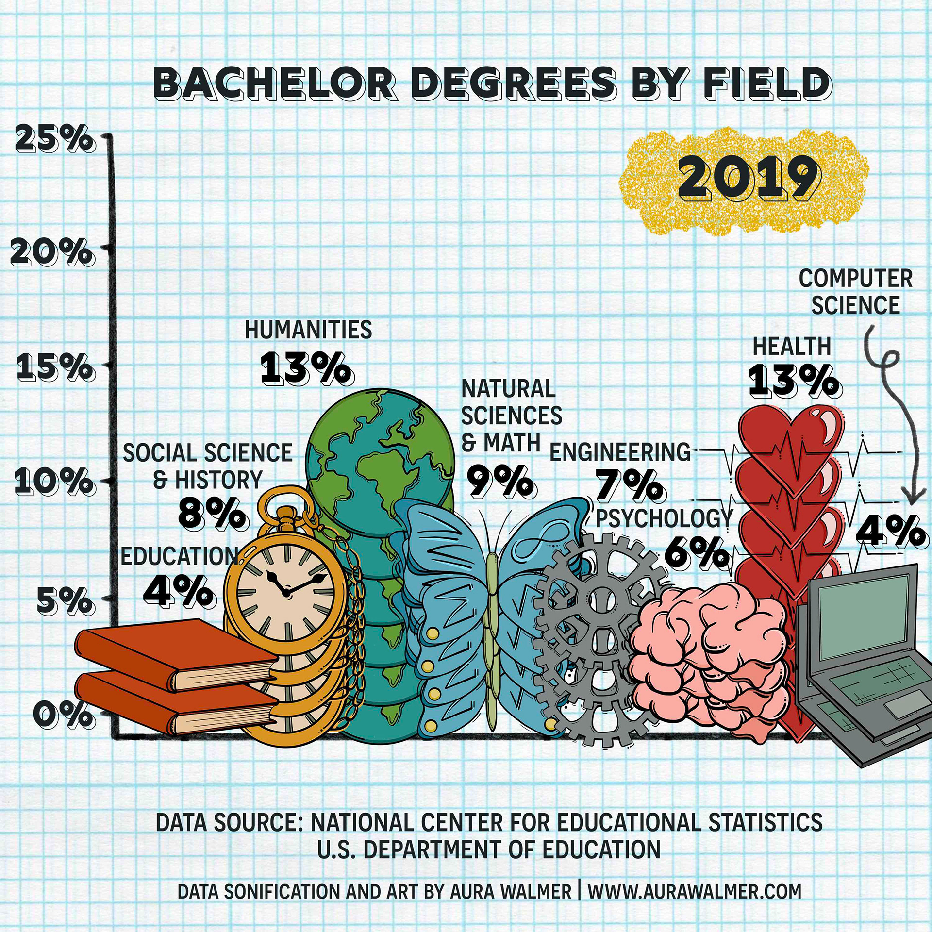
Compilation of all categories in 2019
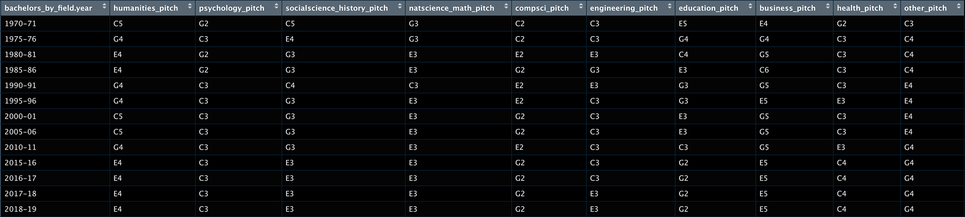
Piano note mappings for each field of study by year
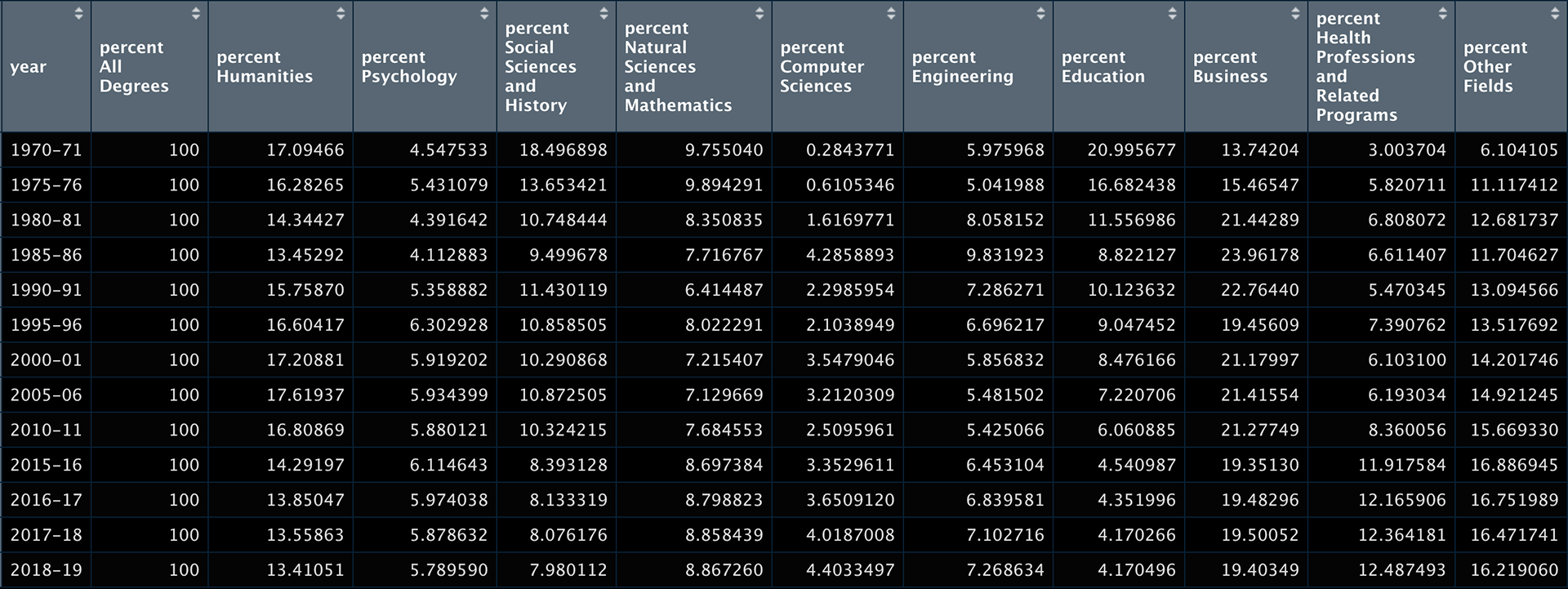
Percentage values for each field of study for each year