Michelin Star Analysis
How the Michelin Guide Drives Underrepresentation in Fine Dining
{December 2023}
How the Michelin Guide Drives Underrepresentation in Fine Dining
{December 2023}

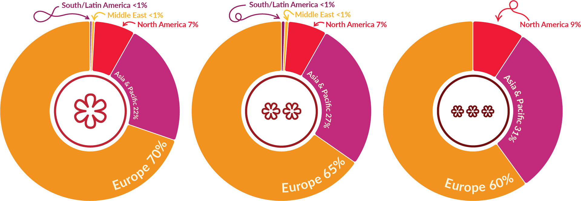
Michelin stars are geographically clustered. Who gets the spotlight?
My curiosity about the industry of Michelin Restaurants was sparked after listening to a podcast episode about Michelin Stars from The Economics of Everyday Things. It motivated me to create a geographic visualization of Michelin restaurants, categorized by rating and cuisine.
I used R to scrape the data from the Michelin website, and I created an infographic using Flourish and Adobe Illustrator.
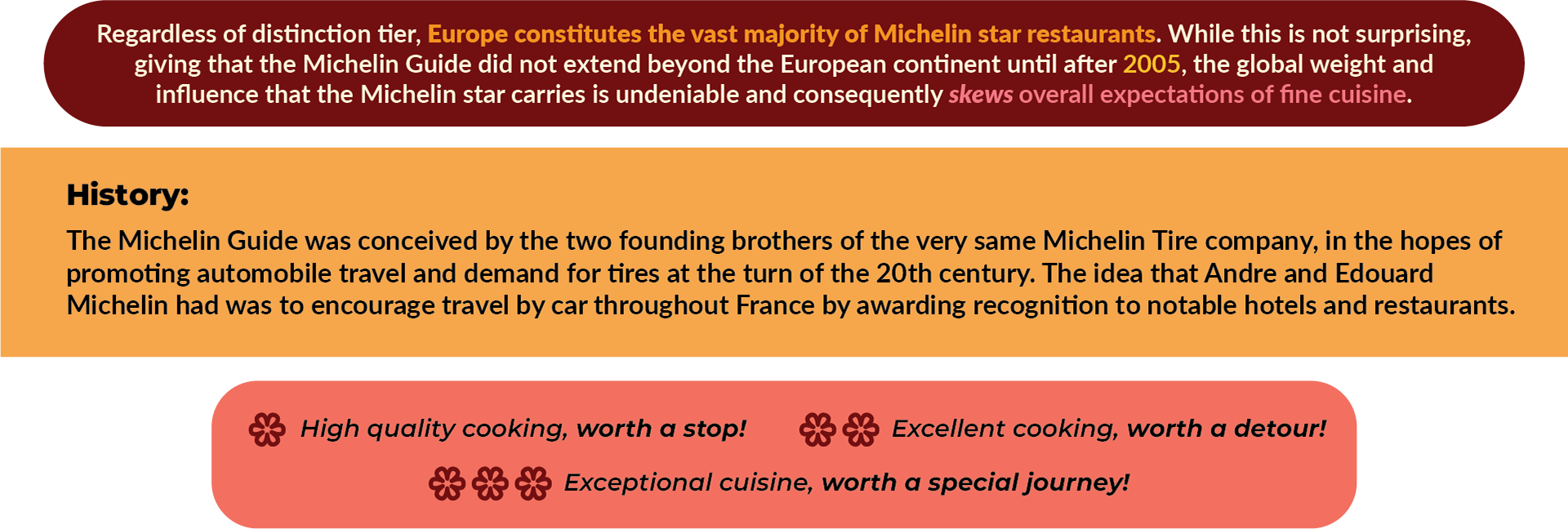
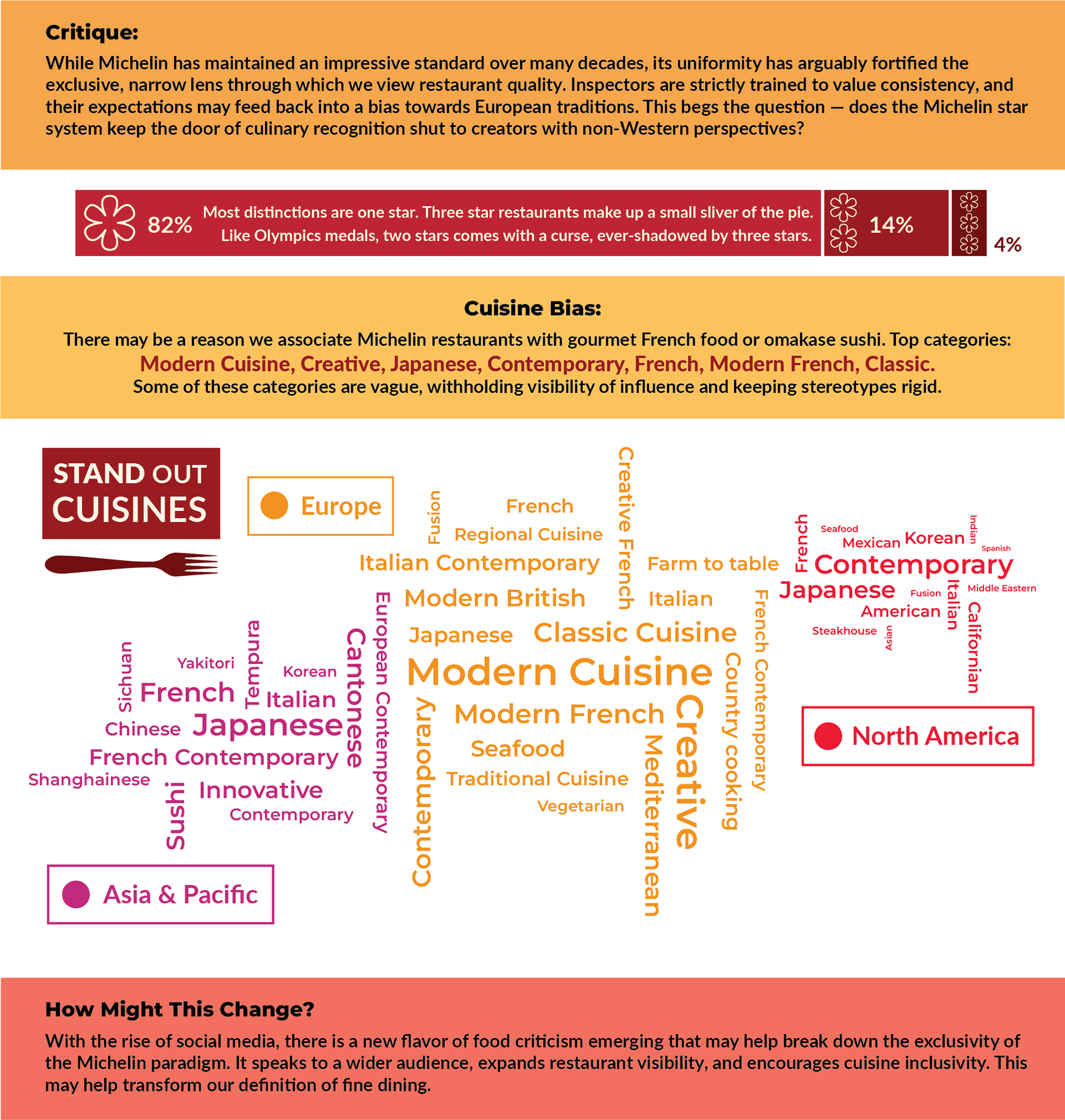
As I explored the data, it opened up a broader question: how might the Michelin schema exacerbate cultural underrepresentation in fine cuisine? How do rigid expectations within the fine dining industry make it difficult for new players to gain recognition?
As I explored the data, it opened up a broader question: how might the Michelin schema exacerbate cultural underrepresentation in fine cuisine? How do rigid expectations within the fine dining industry make it difficult for new players to gain recognition?
See the infographic below to find out more about my findings, and check out the article I wrote on this topic.


Resources listed in the article I created for this project.